CAVALIER AUDIO
THE CHALLENGE
I was approached by a former client with the ambitious aim of not just launching a new line of smart speakers, but to create a comprehensive lifestyle brand from the ground up. The development schedule would be aggressive, the standards and ambition of the client were admirably high, and the marketplace was extremely competitive. I was excited to get started.
THE IMAGE
The client had already done some initial market identification in-house, so I began by building on the wants and needs of that key user, who we identified as 65/35 male/female, between 30 and 40. The ideal user is attracted to vintage products and aesthetic, and above all else desires authenticity in the products and experiences they interact with. The trick would be how to blend leading edge smart speaker technology with authenticity without it feeling forced or fake. The treatment would have to be baked-in, not merely painted-on.
THE BRAND
The next step would be to conduct name exploration with the aim of creating a brand that would encompass all the qualities which we wanted the final product to exemplify. Below are some of the names that we explored and the reasoning behind them. Ultimately, we chose the name "Cavalier" because the client felt it best suited their vision and aligned most closely with the target user.
THE LOGOTYPE
The next step was to give the chosen brand a logo that would communicate the right qualities to the consumer. We took the brand in a number of creative directions during this phase: Some logos played up the meaning of the word "Cavalier" literally, with imagery of horses, crests, and associated elements. Other logos made use of stylized scripts to evoke a vintage feel similar to that of classic cars and electric guitars. Ultimately we chose a cleaner, simpler logo with an attached icon that was meant to remind one of a vintage-style volume knob being turned. The overall effect is clean without being sterile, and highly versatile in a variety of applications, including very small stamping or printing
THE MATERIALS
One of the first things that came up during our competitive analysis was that while larger vintage speaker incorporate materials like leather, wood, and metal, smart speakers are more minimal affairs that rely on plastic and muted fabrics to blend into households. While this makes perfect sense for mass-market brands like Google or Amazon, we wanted to convey a very different feeling with Cavalier. Very early in the development process, we began to speak to sourcing experts and engineers who specialize in use of wood, leather, and metals in a mass-production setting. Thinking about how these materials can be used most effectively gave us a lot of ideas as well as a lot of constraints of which to be mindful as we continued development.
THE CONCEPTS
The next step was to take what we had learned from the branding and marketing initiatives, combine it with what we had discovered during material exploration, and apply it to the creation of early concepts. At this stage, there wasn't a lot of constraint in terms of price, form factor, or functionality; Rather the aim was to create something that just "felt right" on a qualitative level. This meant that I tried a lot of different types of speakers, ranging from paperback-sized portable speakers to larger stationary units. Which product would exemplify the brand best? Which would resonate the most strongly with our user base? Which would look unique enough to get noticed, but not so alien as to become dated over time? The images shown only tell a tiny part of the explorations we conducted before choosing which concepts to develop further.
ALL IN THE DETAILS
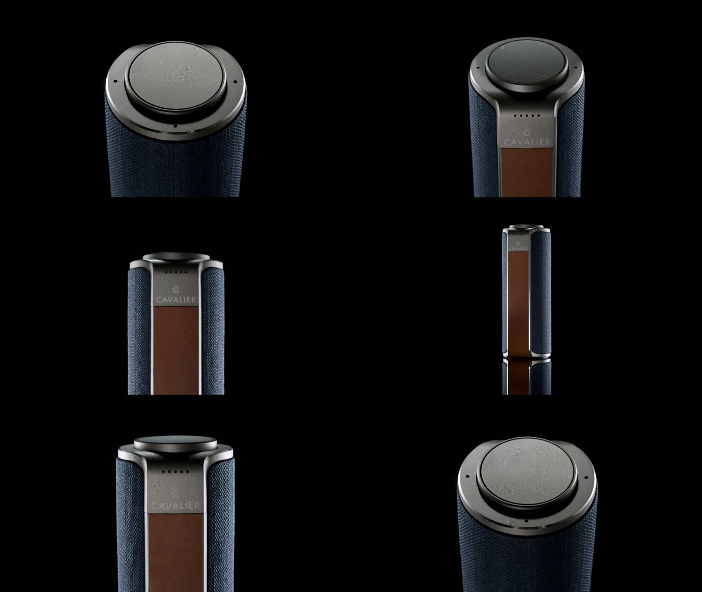
As development continued, we tightened up the design by adding detail to our CAD models, learning more about material application, putting together turnover documents, and speccing the sound requirement. While we decided against using wood for the initial lineup, we kept the metal frame with polished edges, as well as leather details for a warm tactile experience. Little by little, the ideas transformed into realized products.
THE LINE
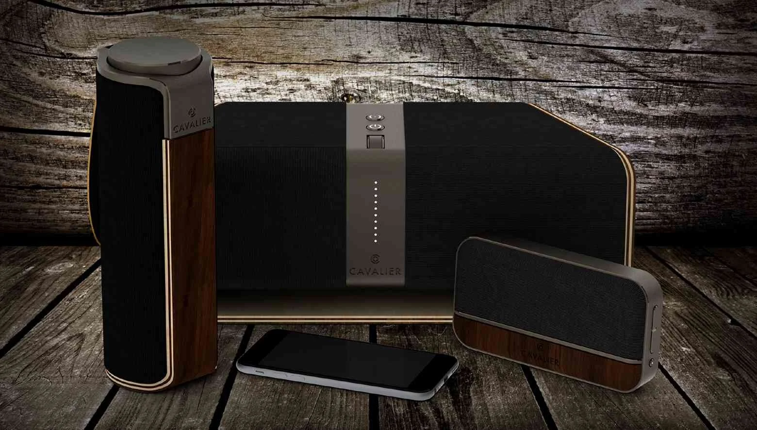
The initial lineup for Cavalier comprises 3 products that share a common aesthetic and material library. At this stage, I put together a sales presentation that would capture everything that Cavalier was trying to exemplify, from brand to product.
THE SCHEME
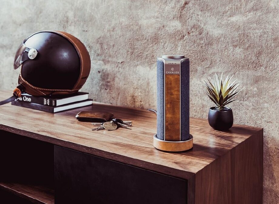
We played with a variety of color schemes based on materials that had inspired us. Because the brand was conceived from inception to be sold primarily through online channels, the possibility of multiple SKUs was reasonable. For launch, we ultimately chose two color schemes: A black on black affair (which really made the metal details pop), and a navy and caramel leather scheme that was particularly expressive and unique.
THE PACKAGING
Even though the product was intended to be sold through online channels, a quality package and its associated unboxing experience were deemed to be important towards maintaining the brand image. Shown here is an early packaging concept that plays up the iconic nature of both the product as well as the brand.
THE SITE
My experience in graphics and user experience (UX) allowed me to work up a series of medium and high fidelity wireframes for Cavalier's web presence. This would give guidance to the web team that would ultimately create the final version of the website www.cavalieraudio.com
Cavalier Audio launched in July 2018 to rave reviews from both editorials and consumers. The initial product, dubbed "Maverick" represents an ideal proportion of inspired design and brilliant engineering. Coupled with charismatic branding and attention to detail that goes far beyond what is normally seen in consumer electronics, Cavalier is poised to be a unprecedented success.


