THE CHALLENGE
A smartphone can be a wonderful thing for the avid runner, giving them the ability to track their progress, listen to motivating music, and know their location and proximities, all while being able to stay in contact. But, all that functionality can easily become a distraction while running.
After using a variety of apps I noticed that there were certain aspects I felt could be improved with the aim of giving runners what they need, without adding uneccesary features. Above all else, the result needed to be easy to use one-handed without breaking a runner's stride while at speed.
ONE: ENVIRONMENT & FEEL
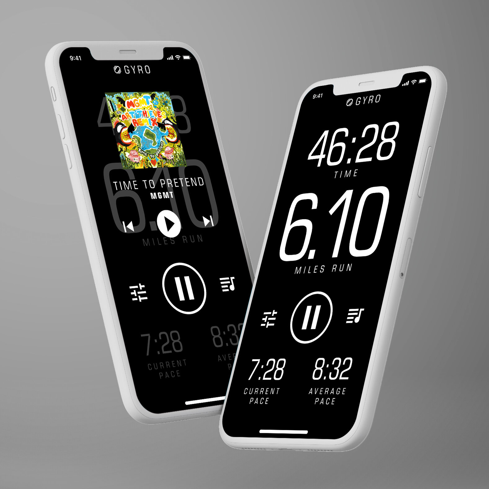
The vast majority of running apps are very bright with lots of white space and strong colors to give it a sporty feel. What this means is that they can be very difficult to look at when running after sunset and end up ruining your night vision every time you look at them. The advent of OLED screens means you can reduce the amount of light cast by a screen if you keep as much of it black as possible. I also felt that using colors often was more about the branding of the app than the functionality itself, so I decided to keep it monochrome.
TWO: EASE OF USE
I found that apps either had multiple screens to access different info or had a single screen that contained info that was too small/cluttered to look at while in motion. A highly evolved competitive ecosystem for these apps has resulted in more than a little feature creep and I felt that usability was being heavily compromised. I wanted to get the info a user would need at a glance to play nicely on a single screen, with an easy to reach button that would bring up a streamlined music control overlay.
More telling were the things that were omitted, such as maps (people I spoke to tend to already have maps apps that they are comfortable using), a social function (this aspect of running apps seems to be trending down but could be added later if warranted), as well as features for more advanced users such as heartrate/pulse monitor functionality and detailed progress graphing. There are already plenty of apps that claim to do it all, I wanted this to do what is most important very well.
THREE: STABILITY
Shaking. When a runner is moving at speed and want to check their progress, they instinctively change that arm's movement to steady the phone in relation to the eye. But, the more they have to do this, the more of a negative impact it has on the running experience. I'd already tackled this by making the info uncluttered and on a single screen so the user wouldn't need to spend more time looking than necessary. But, I wanted to add one more innovation that could really improve the experience as well as giving the app a competitive and unique feature.
Therefore, the app uses the phone's own accellerometer and magnetometer to provide a screen stabilization function, countering out some of the rhythmic shaking/vibration that occur during running; Basically I'm taking the way image stabilization works on a camera and reversing it. As I think about it, this kind of feature alone could be very beneficial in a number of scenarios, from people with muscle tremors to reading instrumentation on a boat at speed. It's from this unique feature that I completed the project by giving my app a suitable name: Gyro.
FOUR: ERGONOMICS
As smartphone screens get larger and larger, they get harder to hold and interact with easily with one hand. A lot of apps place the all-important stop-go button somewhere along the bottom edge of the screen, which makes pushing it difficult without dropping the phone.
Also, menus were often accessed by pressing spots near the top of the screen or by sliding a tray from the side, both of which are hard to do one-handed while gripping the phone firmly. Therefore, I wanted the only pressable areas to be between 1/3 and 1/2 of the way up the phone, where the thumb is most likely to be while grasping.
After all, if a running app can’t be used intuitively while actually running, what’s the point?


