iHOME STUDIO SERIES
THE CHALLENGE
By 2008, the iHome brand had expanded from a single $100 device to an extensive family of products, ranging from $20 to $200. The name “iHome” had suddenly become a term so ubiquitous that consumers were using the name for any product with an iPod dock. I proposed that we develop a so-called “halo” product to maintain iHome’s reputation as innovators and to help establish the brand as a legitimate “audio first” solution. The criteria was simple:
• Designed from the outset to work with the Apple iPhone.
• Class-leading sound quality.
• An aesthetic that speaks strongly of its audio prowess.
I GET INSPIRED
I felt that there had always been a rift between the world of consumer iPod docks and the world of hi-fi. While largely constrained by plastic as the primary material, I wanted to give the product a flavor normally seen in showcase-type loudspeakers. These products convey the language of sound in a very different way, celebrating the beauty of the speakers themselves, making the form support the essential components instead of vice versa. The speaker itself became the inspiration for the rest of the product.
PEN TO PAPER
A big part of what makes a design process flow properly is knowing what medium is appropriate for any given phase of development. I start loose, put pen to paper, and doodle incessantly. Ideations should be quick, expressive, and never precious. These sketches are purely intended to establish dialogue between the designers and because of their often quirky qualities, they are seldom shown during formal presentations.
During the sketch phase, I kept coming back to shapes that used the speakers themselves as the main visual language
first concept
A simple drafted wood cabinet, clean and minimal, guaranteed not to offend. From an engineering and acoustical standpoint, it was fine. As a brand statement, it did little to quicken the pulse. The team suggested that I think “bigger”.
second concept
Go vertical. This design was more dynamic and visually impressive than the first, but at the expense of acoustic practicality. The wood cabinet still imparted a crafted appearance, but limited creative form factors and would complicate assembly. As much as I loved the feel of wood underhand, plastic was the only way to break out of the “heavy box” aesthetic.
THIRD CONCEPT
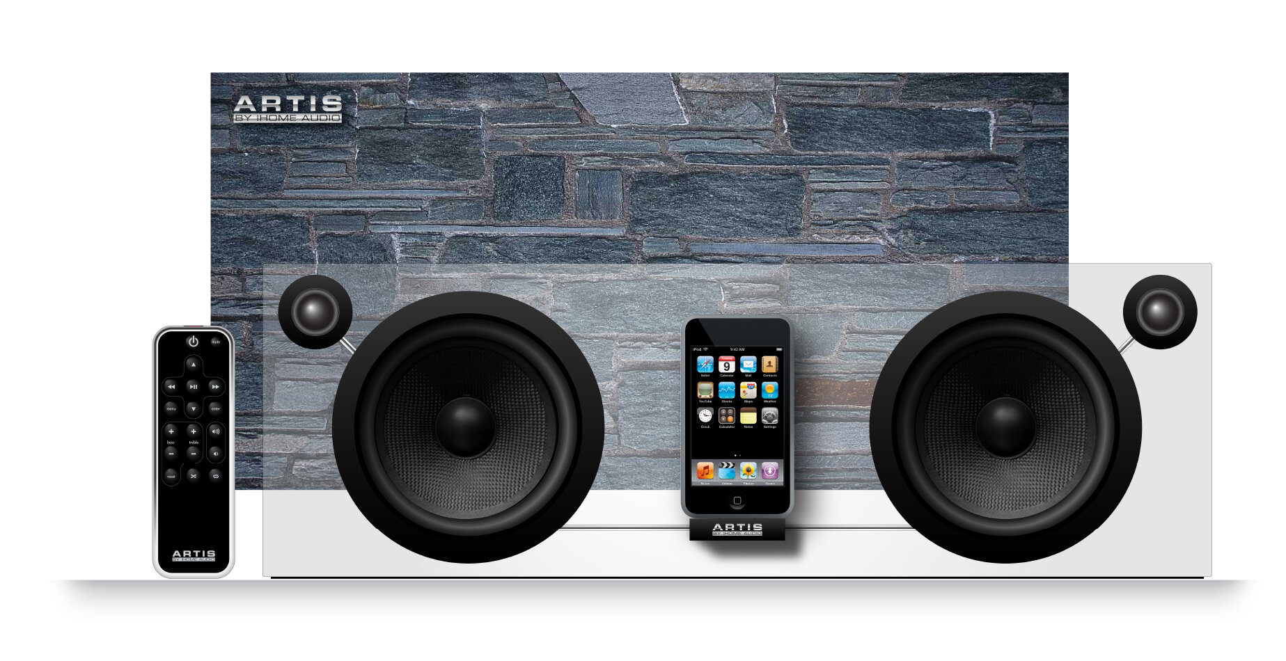
Visual mass kept getting in the way of a lot of my designs. It seemed that no matter how shapely a wood or plastic cabinet I came up with, the volume required for speaker chambers turned the product into something ungainly. I started to think about transparency. Could we suspend our components in a thick sheet of glass or polycarbonate? It was definitely novel, but I didn’t know how realistic it was.
I showed the above rendering and the team liked the airy, minimal feeling that I was going for. So I decided to develop the idea and translate it into something real.
development
Once the concept is chosen, the development phase begins. During this stage, I work in several directions at once, ranging from formgiving to user interface, from 3D CAD to foam models. Changes in one medium reflect themselves in the other mediums as the product goes from concept to reality. Maintaining the original design intent becomes challenging: Sound engineers always insist on the largest speaker chambers possible, electrical engineers request more-than-abundant room for components, while the sales department asks for the smallest product possible. A balance must be achieved.
RESULT
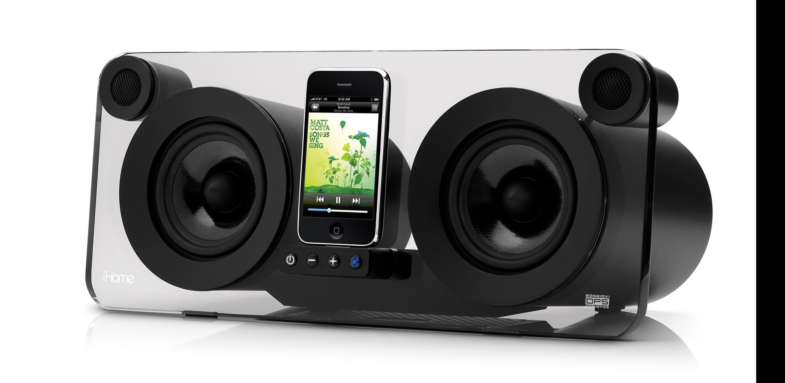
Simple yet powerful, the iP1 delivers the basics in breathtaking style. It represents the cutting edge in digital audio reproduction and industrial design, offering a highly efficient 4-channel amplifier solution complemented by the patented Bongiovi Acoustics Digital Power Station technology.
Dock your iPhone or iPod and prepare for bliss. Operate the iP1 from a distance and control basic music menu functions in comfort using the included remote control. Listen to alternate audio sources via the line-in jack. There's even an A/V port to output your iPhone/iPod videos.
Bongiovi Acoustics' Digital Power Station technology provides the first real-time digital processor in a consumer electronics application. It samples and analyzes audio in real time and restores harmonics lost to today's compressed audio formats. So your music sounds the way the artist intended.
-Copy written for The Apple Store
BRANDING
Ghost: At first, the product’s transparent acrylic led me in the direction of names like Ghost, Phantom, and Spirit. The downside to this kind of identity was that it didn’t particularly suit an audio product.
One: I liked the simple, primary quality of names like Solo, Alpha, and One. This is a smart branding strategy for products that are intended to redefine segments through simplicity. The logo evokes the circular design of the exposed speakers.
iHome One: Because this product was intended primarily as a brand statement, we decided to put the iHome name into the product name itself. The logo was inspired by high-end cosmetics. The quality is lithe and mysterious.
Studio Series: By this stage, it had been determined that the product would be expanded into a series; a shift from the product as a singular entity into a family of similarly branded products became necessary. The final name selected was iHome Studio Series.
PRINT CAMPAIGN
Whenever possible, I love to participate in brainstorming for advertising campaigns. These concepts were designed to convey the subtle sound reproductive qualities of the iHome iP1. It's tricky to convey a message of sound in a print ad, but I think that the "Don't just hear it, feel it" concept was an impactful way of getting the message across.
OUT INTO THE WORLD
Working at a small firm like SDI provided a rare opportunity for me to create all the supporting media for the iP1 Studio Series. This included the design of three different in-store displays, retail packaging, print advertising and even the instruction manual. I also assisted on the brainstorming and storyboarding for the television ads, as well as worked with our PR firm on promotional strategy. My extensive involvement resulted in a strong singular vision, augmented by the talents of a truly devoted team. My designs at SDI always reflect the input and hard work of a multitalented cast, but the end result still maintains the drama, potency, and elegance of the original idea as it was on day one.


